Did you know the colors you choose for your marketing could send a different message than intended? Our eyes are drawn to color before we consciously recognize a design, and subconsciously we make associations for those colors based on things like emotions, items, and experiences.
Color association is something that begins as soon as early childhood. If you think back to your kindergarten years, you were given a yellow sticker for being happy, blue for sad, and red for angry. Baby girls often get wrapped in pink, while boys get blue. Red is hot, blue is cold. These associations stick with us, even in adulthood.
This brings us to the psychology of color. In this post, we’ll dig into examples of how color can change people’s understanding of an image. In this post we’ll explore how,
Color Sets the Mood
Let’s take a look at movies. Imagine an old black and white movie set on a shaded forest path. In black and white, the monotone greyscale can give a sinister feeling to the scene. Deep, dark shadows make this scene more serious while giving the impression of a grim outcome.
Now take that same scene, but let’s add some color. The path is lined with crisp, vibrant, green grass, along with a blue sky and some intense yellow-green trees.
This immediately changes the mood from grim and sinister to lively and welcoming.
Vibrant colors, associated with beautiful days, create a starkly different atmosphere than the black and white version, associated with bad weather or depressing events.


This is one of the reasons why suspenseful or ‘dark’ movies frequently have washed out color palettes and use darker colors and deeper shadows. The color choices set the mood and enhance the experience by drawing viewers in using the subconscious recognition of color association.
Color in Marketing
When using color in your marketing materials, your color associations are important, but you also need to look through the lens of someone who has never seen or heard about your business. Think about what your colors will imply if there’s no other context.


One example of color impact is this logo draft for a hot yoga studio. When the logo uses blues and purples, psychologically it lends a more calming vibe. It might feel like calm water and brings to mind a more traditional yoga studio. But when we change those colors to reds and oranges, it will make people think of heat, and maybe sweat.
If you show the blue logo to the public with no other words or context, would the people you’re advertising to interpret it as a Hot Yoga practice? Probably not.
This simple color change affects the entire message of the logo.
Meanings and Associations: Primary Colors
Now that we’ve looked at some examples of color usage and associations in pop culture and marketing, let’s take a look at common color associations with primary colors.
To use color more effectively in your marketing, make sure the tone, intensity, and associations match or enhance what you’re advertising.
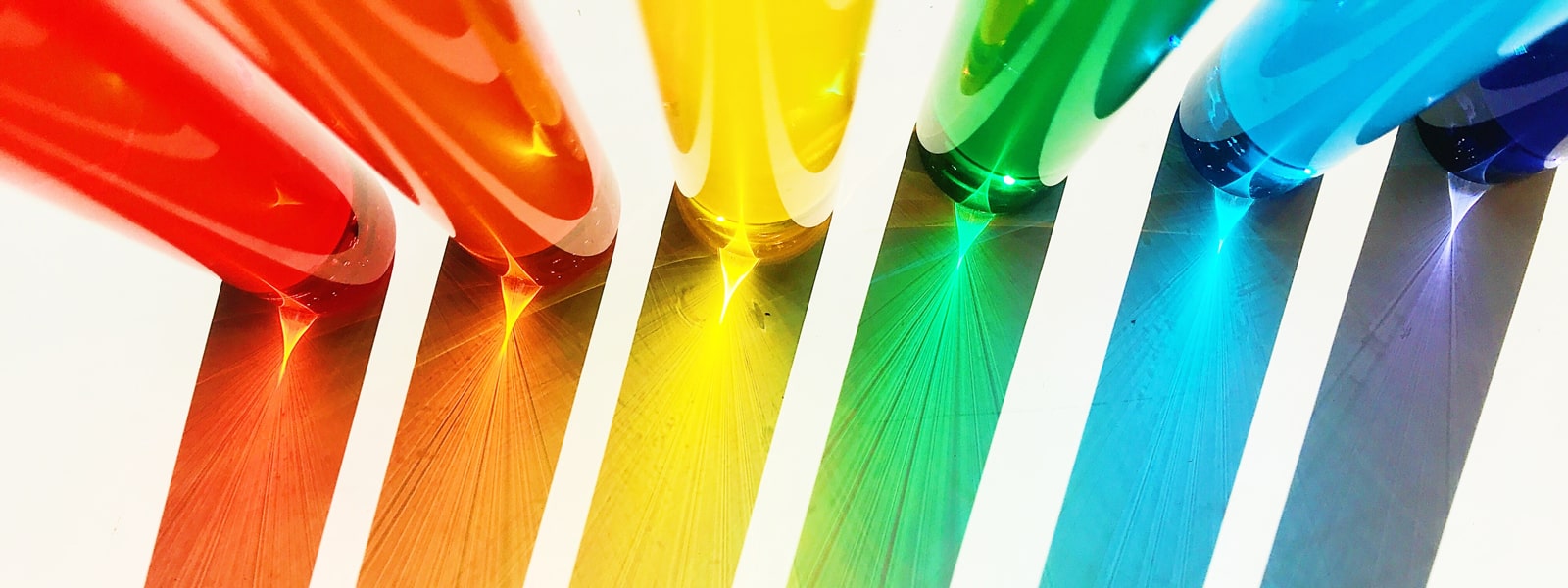
Red
Red is loud, eye-catching, and represents love, rage, fire, heat, anger, aggression, and intensity.
Generally, red should not be used for anything calming, like a doctors office or a library.
Red can be used in marketing to evoke intense emotion and desire, as with Valentine’s Day marketing. It can also be used to express rage, like in books where a character turns “red with anger,” or heat like in our hot yoga example above.
Blue
Blue is subdued, calm, and brings to mind sadness, cleanness, water, concentration, relaxation, peace, flow, and focus.
Energetic places, like gyms or dojos, often avoid calming blue hues that might dampen the mood.
In books, sad characters are sometimes described as “blue.” Blue is associated with clear skies and crisp, clean water. It feels relaxing and meditative, and is often used by traditional yoga studios. Blue is also used in offices to promote calmness and focus.
Yellow
Yellow feels sunny, fun, joyful, positive, cheerful, hot, excited, and warm.
It is not a color that should be used for something somber or calm.
Yellow can bring up memories of sunny summer days filled with laughter, fun, and games. Yellow is used in cards, toys, and items meant to bring happiness and joy. It can also be associated with positivity and new life, as seen in spring when the sun melts the snow and brings flowers and life back to the world.
Other Colors
While we’ve looked at the three primary colors, remember that there are many other colors and shades that have their own meanings and associations. Pink and red are similar and both can mean love, but pink is not associated with anger the way red is. While a light blue and a dark blue can both mean peace and relaxation.
Color Before Text
The most important thing when deciding on colors for your marketing materials is to look at your marketing without text clues. If you don’t see any associations between your marketing colors and the essence of your business, your audience won’t be able to either. Remember our Hot Yoga example with its hot vs cool color schemes.
Over our lifetime we have made connections to color based on emotions, events, items, and nature. Chances are that your target audience will have made many of those same connections. Use this experience to give meaning to your marketing where words may be missed or misunderstood.